Engageli Remote Learning Platform
Problem Statement
How can we make remote learning more engaging?
User Research & Interface Design for Educational Technology & Remote Learning
Competitive analysis, heuristic review, task analysis, survey, user personas, wireframing
Role
UX Researcher & Designer
Year
2021

What is Engageli?
Created during quarantine for the first wave of COVID-19, Engageli is a digital learning platform that aims to improve the remote learning experience. Engageli provides higher education institutions with an innovative learning model that capitalizes on already-existing tools and monitors student engagement in real time.
Problem Framing & Scope
Problem
Engageli is a new platform and is trying to define their space in remote learning. Our team, Humanli, worked to identify room for improvement in the interface and what functions are seen as most valuable by users.
Scope
In our exploration, Humanli evaluated the Enageli platform with a variety of research methods to provide recommendations for product improvements. We wanted to identify wins, pain points, and opportunities to make the platform satisfactory, intuitive, and efficient.
Initial Team Challenges
Our Team faced two major challenges as we set off to improve Engageli:
Time Zones - Most of our team was in East coast time, but one member was in Asia, so scheduling made it challenging to collaborate as much as we might have liked.
Limited Time Constraints - Our work on this project lasted only a few weeks, so we were not able to be as thorough as we might have been with more time. This would have greatly benefited us in the design stage of our project, as we were only able to create low-fidelity wireframes.
What problem are we trying to solve? For who?
Learning Our Users’ Needs
In order to understand our users, we engaged in a series of research methods:
Literature Review
We conducted initial research to better understand the problem space, specifically what were the most important parts of in-person learning that we would need to translate to a virtual learning experience:
The level of challenge of the course
Amount of active collaboration
Student faculty interaction
Supportive environment
Enriching experience
Survey
We surveyed both educators and students via Qualtrics to understand how students (8) and educators (10) were already using online platforms. Some top findings included:
Most users used Zoom
Teachers want more engagement in their classes, which they currently notice more in smaller classes
Students perceive their peers’ participation as below medium
Break out rooms and screen share had mixed reviews with users noting both likes and dislikes for both as ways to engage with others
Competitive Analysis
Through our competitive analysis, we sought to understand Engageli’s features in comparison to other online platforms.The level of challenge of the course.

Behavioral & Cognitive Task Analysis
We examined how people used Engageli when they had no previous experience using the platform. Through task analysis, we were able to identify specific areas where users struggled, such as screen sharing, pinning a window, and more.
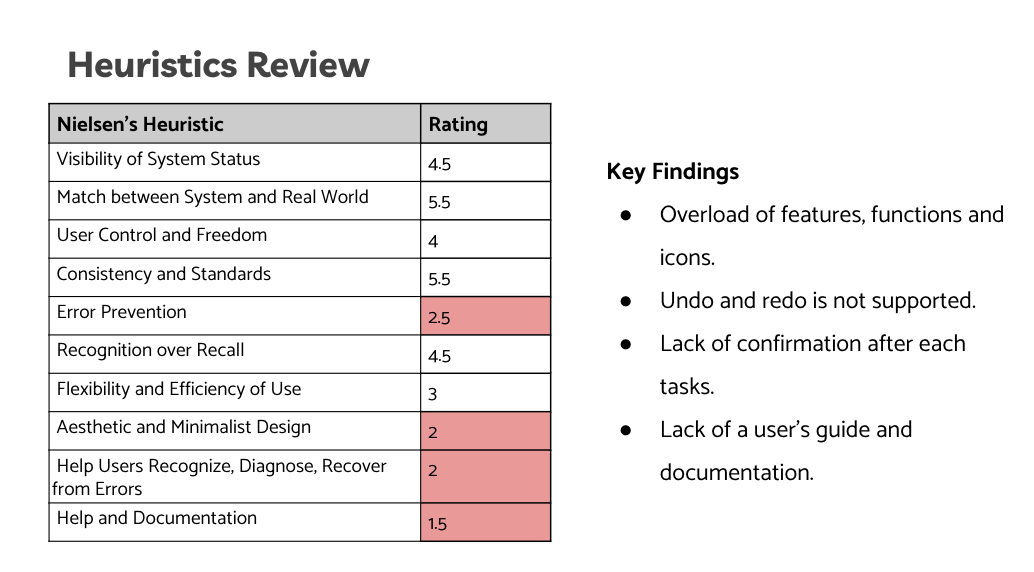
Heuristic Evaluation
We used Nielsen’s Usability Heuristics to review the Engageli interface and identify user pain points.
Who are the users and what do they need?
User Personas & Defining Requirements
User Personas
Techie Tina
A Tech Savy Teacher

Honest Hal
A Seasoned Teacher Learning Remote Platforms

Darling Daisy
An Empathetic Student

Defining Needs & Requirements
User Needs
User needs to conclude or stop class when they want
User needs to access multiple features to lead effective and engaging classes
User needs to be able to get real-time feedback from students
User needs to manage screen and class while sharing their screen
User needs to troubleshoot and manage breakout rooms
User needs to quickly and easily assign breakout rooms
User Requirements
Interface must have visible, easy to access “End Class” action
Interface must have intuitive features that are easy to access
Interface must allow user to see and encourage questions, comments, etc.
Interface must have visibility of screen and students when screen is shared
Interface should have visibility of students in breakout rooms without user joining
Interface should allow assignment to breakout rooms by parameters or randomly
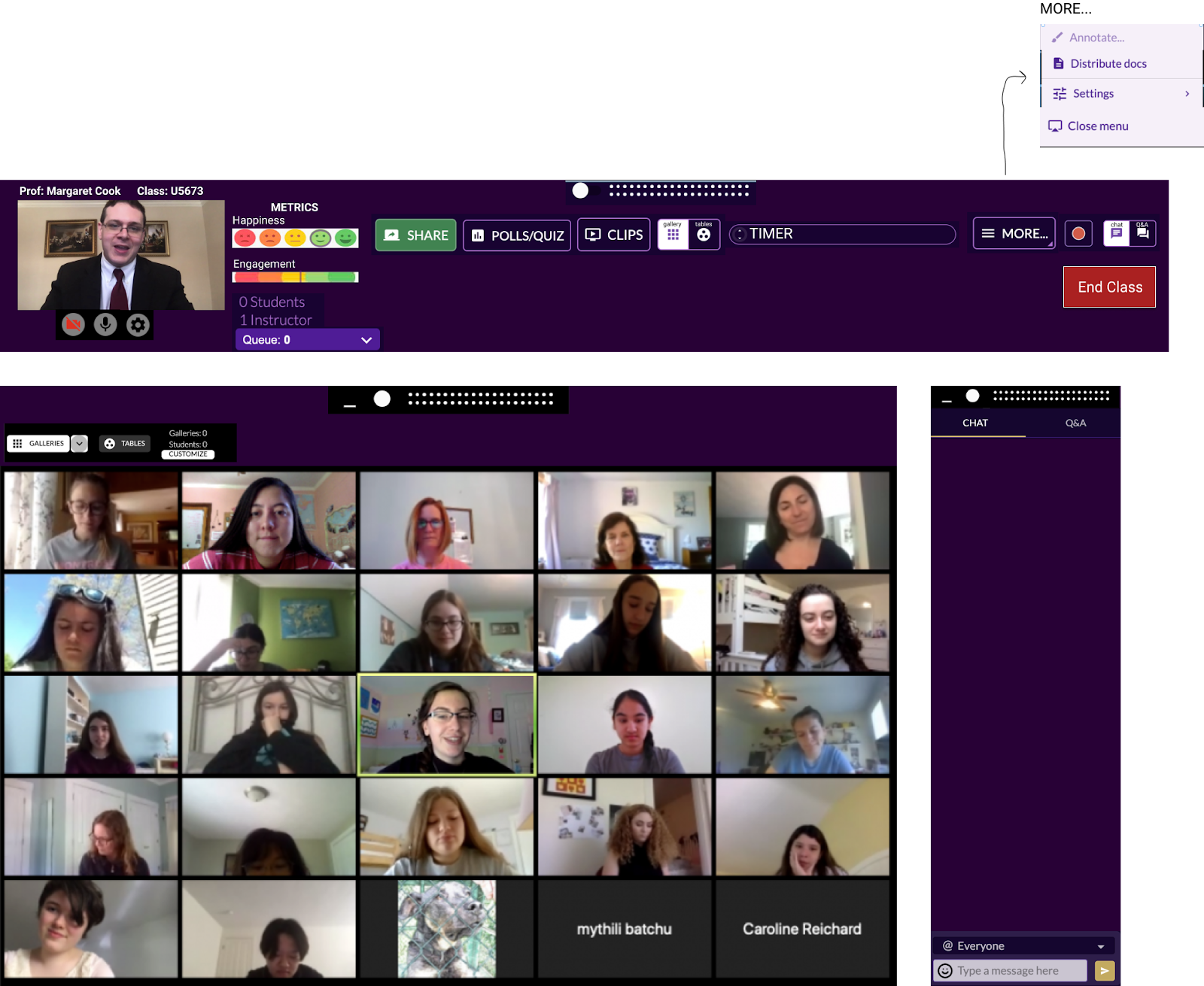
Initial Low-Fidelity Wireframe

What did we do right? What could we do better?
Usability Tests & Takeaways
Usability Tests
We conducted 6 remote usability tests with our Figma wireframes, where we asked users to complete several tasks, such as sharing their screen, toggling between table and gallery view, using the chat to answer or send questions, join a table, play a video, pin a window, and end the class.


Key Findings
Confusion around galleries and tables
Confusion around timer function
Trouble understanding where and how to pin a window
Confusion around engagement and happiness metrics
Takeaways
Design Recommendations
Remove menu option next to galleries so toggling is more intuitive
Label timer and make it more salient
Make window options bigger and include tutorial of how to use functions prior to use
Use more distinct measurements for engagement and more intuitive icons for happiness
Final Designs

Table View Redesigned
Gallery View Redesigned

Details & Iconography
Concluding Thoughts
With our design recommendations, Engageli could make their interface easier to use, more engaging, and more efficient for students and teachers. In hindsight, most of their usability issues that we identified came from the likelihood that users would be familiar with other remote learning platforms, such as Zoom, which used different iconography and colors. Because Zoom, Teams, and Google Meet are more generic, they also have simpler interfaces, since less functionality (like tables and timers) is needed up front.
Looking Back: Room for Improvement
My biggest regret for this project is that we were not bolder with our designs decisions. We stayed true to Engageli’s interface, and it would have been nice to think more outside of the box and adjust more of the interface. In hindsight, we really limited ourselves to the top toolbar, and I wish that we had thought about other ways to use the screen.